| Entrance | Mainstreet | Wiki | Register |
|
# of watchers: 18
| D20: 1 |
| Wiki-page rating |  Stumble! Stumble! |
| Informative: | 0 |
| Artistic: | 10 |
| Funny-rating: | 10 |
| Friendly: | 0 |


2008-09-30 [Hendercrazy]:
[deeterhi]
First comic.
Punchline: A-
Use of Subject Matter: A
Complimentary Artwork: A+
Final Grade: A
Comments: I loved the idea of a chess championship! :) The reaction of the dragon losing is quite funny. The reaction of the dragon in the background is priceless! XD Maybe this should've been in the forefront? This has everything to do with dragons too. The artwork supports the punchline and brings a wonderful atmosphere. :D Color takes this one over the top. Great job!
Second comic.
Punchline: B+
Use of Subject Matter: A
Complimentary Artwork: B
Final Grade: B+
Comments: The baby dragon playing with it's food is good stuff. XD The artwork once again is very nice! Great style. :) Showing more of the scene (and the mother dragon) might have given this one a chance to bring even more punch to the punchline and overall comic? Good job.
[Nocturnaliss]
Punchline: B+
Use of Subject Matter: B
Complimentary Artwork: C+
Final Grade: B-
Comments: The idea is funny and makes you think too! :) :P The lettering in the signs were a little hard to read. Making them more legible would really help out the delivery of the punchline more. ;) It's very artful overall. A slightly different angle of this scene would likely bring the overall comic out more (instead of the straight-on shot) as well as the subject matter. Good job!
[Yncke]
First comic.
Punchline: C
Use of Subject Matter: C-
Complimentary Artwork: B
Final Grade: C
Comments: The artwork stands out the most here. Lovely castle design! :D While the punchline of the cartoon is funny... it versus the actual subject matter doesn't overall relate. Especially since you had to tell us dragons were on the flags. The comic needs to be able to speak for itself. Perhaps if there were some dragons in the courtyard this would've had some better punch? This one had great effort... just needs work on the selling of the punchline and making it more clear cut. Nice effort. :)
Second comic.
Punchline: B-
Use of Subject Matter: C-
Complimentary Artwork: B+
Final Grade: B-/C+
Comments: Really good art. :) The punchline is pretty darn funny after doing the math (Dwarf + big frickin' battle axe + ladder = Dragon head chopper offer). :P The selling point being the ladder and the ridiculousness of him using it. XD Just not sure how many folks will do the math to really get it. Perhaps having him stand in between two serious, taller, obviously more experienced and heavily armored dragonslayers would amp this one up a notch or two? Good work though. The thinking on this one is good. The delivery needs more umph. :)
2008-09-30 [Hendercrazy]: BTW... I need to know who all wants their comic(s) to appear in upcoming issue the Herald or not! I need to know today! Thanks! :D
2008-09-30 [Yncke]: Could you elaborate on the A-B-C system, please? I know of at least two interpretation
The design of the castle is not entirely mine, it's from a reference I found that came close enough to what I wanted.
Could you elaborate how the second comic doesn't stick to the subject? I know the first one has migrated far away from dragons, but since the second one gets the same letter as the first one, I assume it is just as bad as the first one, while a dragonslayer seems to be quite close to the topic, no?
A line up would have worked a lot better, indeed.
The herald is fine by me. The more comics in there, the better. ;)
2008-09-30 [deeterhi]: I'm not gonna put a grade on anyone's artwork, but I am going to give my comments and critiques :)
[Nocturnaliss]- I thought this was a very cute comic. I got the joke right away. The main problem I see is that there isn't enough information in the drawing itself to know that the little guy is sitting inside of a dragon as opposed to any other kind of monster. The problem being since the topic is about dragons. The lettering didn't bother me. Since you weren't going to add color and because the style is so simplistic, it would have been nice to see some shades of gray in there to help give more depth to the image.
[Yncke]- I got the joke to the first one more than I understood the second one. I didn't feel like there was any great significance placed on the ladder and how it related to the punchline. In both cases, though I think it would have helped if there was more information in the drawings (in the environment/at
[Hendercrazy]- Nice concept. As a side note, it would be interesting to know what the knight was trying to get at in the mousetrap. It's not that important. The joke works without that bit of information though. Because of the style you are working in, I would say the anatomy needs some more work. The female dragon's left hand looks huge, and though you were probably thinking that it should be because that hand is higher and more in the forefront compared to her other hand, it's a little extreme. The way her right hand is bending looks unnatural. The male all around looks better than the female dragon. The knight could use some bents, something to show pressure being put on him. Right now, it looks like he can easily slip out of that trap. There is a nice composition. The focus of the gag is the knight in the mousetrap and he is almost exactly in the middle of the image. I, also, think the expression in the female dragon could have been something else, either disgusted or annoyed or something. As it is, it's exactly like the male dragon's (kind of angry with a smile). If it were something more to the nature of women, the joke would have been even funnier.
As another side note, it's fine with me if you want to use my gag cartoons for the herald.
2008-09-30 [Nocturnaliss]: [deeterhi], I know, mine had a lot of flaws... I kind of had to rush it, because otherwise it wouldn't have gotten done XD I'd intended on adding cracks in the teeth and shininess to the armour and... yeah, I honestly rushed it. I also know it doesn't look like a Dragon's mouth... the more I tried adding to the mouth, the more it detracted from what was going on, so I gave up XD thanks for the critics, I do appreciate knowing these things.
Also: woohoo, B-. XD [Hendercrazy], I know, the lettering's not all that easy to read... did my best to bring it out. Again, I rushed it. Next time, I'll get things done way more ahead of time. XD
(also, forgive if I don't comment on other cartoons right away... have lots of things on my RL-platter right now).
2008-09-30 [windowframe]: Perhaps in Yncke's second comic the word 'overlooked' would have been better than 'ignored', since that would pun more on his height?
2008-10-01 [Hendercrazy]: [Yncke]: I'm using the A,B,C,D,F scale. A the best. F the worst.
As for the second comic... there is a dragon connection. :) I'm just saying that some folks may not make the ladder to the dragon relation. Fantasy fans are likely to get it... but the general populace needs the concept drawn out (connect the dots so-to-speak) for them a bit to understand and interpret. One of the hardest things with cartoons is to satisfy the genre specific audience while still making it work for the general audience too. Hope that makes sense. :)
[deeterhi]: Some great points! :) I kind of tossed mine up still being worked on. I'll be sure to correct a lot of those points when I ink and color the comic. ;)
I'll be putting everyone's cartoon in the Herald then. Thanks for the feedbacks! :D
2008-10-01 [Hendercrazy]: Great job once again to all of you that contributed on the first cartoon!! It was awesome to see what all everyone came up with! :D Even had some COLOR thanks to [deeterhi]! ;) I think the first effort here was overall successful. :)
Now to keep this going. We need a subject, topic or theme for the second one.
Anyone? Anyone? Beuller? XD
2008-10-02 [deeterhi]: ummm, hmmmm.......to
a gag cartoon inspired by/based on a famous painting?
knights you wouldn't want to rescue you?
goblins!?
i don't know........
2008-10-04 [Yncke]: Ah! Now I know of three A-B-C systems. :) (No E? Poor thing, being left out like that.) Thanks, [Hendercrazy], with your system, C isn't as bad as in the systems I know.
I suppose the target audience in this case *is* fantasy fans. :P But yes, it makes very much sense, it only makes it even more difficult than it already is.
Yes, [windowframe], that would have worked so much better! O.o
Topics... hm... death picks up a deceased? Unlikely fantasy situations?
2008-10-04 [Hendercrazy]: Yep [Yncke]... no "E"! I know, it's a ridiculous system. Can you tell it's an american grading system? XD I don't know why it got replaced by the letter F. *shrugs and scratches skull with you* :P Maybe I'll do a 1 - 10 system here on out. The reason I'm doing a grading system is because it tends to be easier to tell folks where there strong points are and weak points are even if they don't get my following comments and crits. :)
Pretty good suggestions so far! Let's toss a few more out and then we'll pick one. :)
2008-10-09 [Jeccabee]: F = fail. I think that's why it was replaced. There were E's in elementary school but that meant excellent. It was on a different grading system. E, S, N, F (excellent, satisfactory, needs work, fail).
2008-10-09 [Jeccabee]: this is a cool contest btw...cant wait to see the next comic idea!
2008-10-09 [Hendercrazy]: You're more than welcome to join us [Jeccabee] for cartoon #2 as well as toss out any ideas for it you might have! :) We've yet to finalize on a subject. :D
2008-10-09 [Jeccabee]: I'll try to think of something and get back to ya. :)
2008-10-22 [deeterhi]: Here are some more ideas, take 'em or leave 'em :)
1. childhood fantasies
2. daily life
3. "If I were a super hero..."
4. mom's mystery meat
...
2008-10-22 [Jeccabee]: I like number 3!
2008-10-22 [Hendercrazy]: The third one is good! :) Everyone want to go with that one for comic #2?
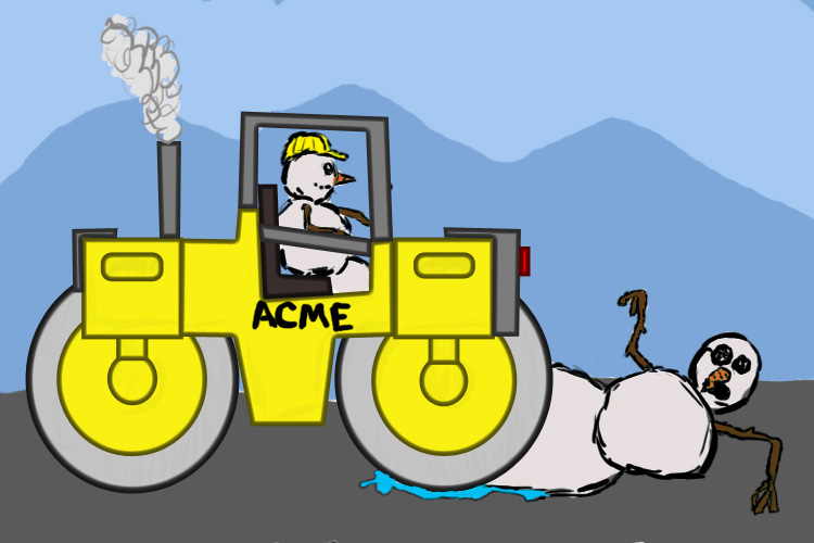
Also, since I'm kind gearing this workshop as a sneaky way to generate more comics into the Town Herald... how about a Christmas (anything goes) one for comic #3?
2008-10-23 [Yncke]: Okidoki. :)
2008-10-23 [Hendercrazy]: So thus far we have:
Comic #2: "If I were a super hero..."
Four Yays / Zero Nays
Comic #3: Christmas (anything goes)
Two Yays / Zero Nays
:)
2008-10-23 [deeterhi]: sounds good to me too :)
| Show these comments on your site |
|
Elftown - Wiki, forums, community and friendship.
|